BRANDING PITCH
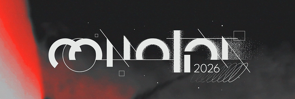
COMOTION 2026 / NEXUS
Nexus is a collaborative branding and title sequence design pitch deck for SCAD CoMotion 2026.
This project explores the interplay between structure and imperfection, tracing the historical lineage of creativity while celebrating experimentation and failure as essential to the process. Each small act of curiosity and invention becomes part of a larger collective motion, expressed through abstract motifs of graphical notation, hands-on practical effects, and iterative experimentation. (full concept below!)
SOFTWARE: After Effects
Practical FX
Photoshop
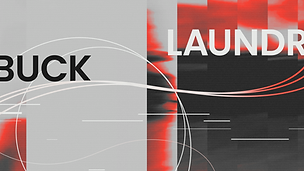
STYLEFRAMES


ALL FRAMES SLIDESHOW


MERCH


CONCEPT STATEMENT
Nexus
Every creative act generates a force that propels our culture forward. These small, intimate moments of action and curiosity- spark and comprise the sum-total of all passion projects and failed endeavors across all disciplines. We as artists adapt, improvise, and play off these miracles of personal invention.
Nexus represents the unified inspiration from all fields and disciplines commonly thought of as separate and incompatible. Artistic, scientific, musical, and mathematical notations collide, scatter, bloom, and morph into new gestures of expression. Each moment triggers another, infinitely borrowing and exchanging inspiration as the collective movement builds a towering visual symphony of the creative enterprise.
Our creative resources are the result of a long, storied, and wildly diverse cross-cultural conversation. This project draws from historical breakthroughs, countless experimentation with practical effects, and the unexpected nature of intuition during the creative processes to bend them, break them, and see where we can lead the next movement.
EXPERIMENTATION
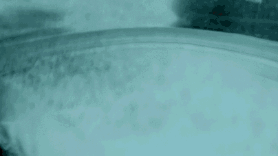
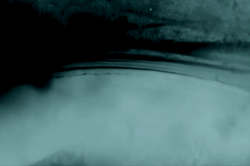
Close up footage of boiling water.
Flashlight held against an electric kettle, captured in a dark room.
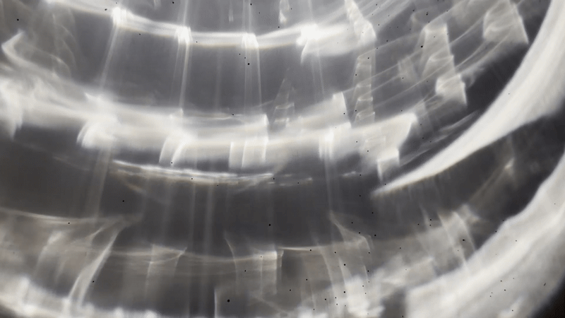
Light refractions
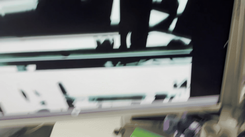
Video Feedback
We always knew for our CoMotion 2026 pitch deck we wanted to experiment with practical effects. Trying new methods always excites us. In our early iterations, we tried feedback loops, scanography, touchdesigner, and lots of in-camera effects. We ended up using mostly this closeup footage from a hot water boiler through an old-school photo booth filter and bringing it into AfterEffects to create unexpected gradient patterns. To say we had a lot of fun in the process is definitely an understatement! (more bts photos at the end)
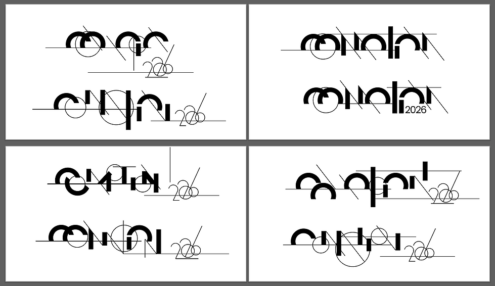
LOGO DEVELOPMENT


3 variations of logos based on usage
Designing the logo was an exciting but challenging task. Our goals for the logo were to
1. echo our visual language with contrast- thin lines vs. heavy stroke
2. keep legibility as a top priority
3. be clean and simple
4. create a memorable and recognizable mark that can be scalable
5. have potential to be in motion
6. be flexible based on how it's going to be used, banners, mark, etc
Early explorations and iterations on logo


Preliminary doodles and brain dump
VISUAL EXPLORATIONS AND ITERATIONS

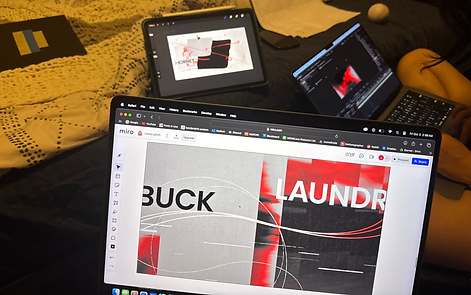
Full Miro Board


Moodboard + Styleboard
One of the challenges we were aware of was the differences in our personal styles and how we were going to use them to our advantage and integrate them seamlessly. We did a ton of iterations, so we were always on the same page with each other, and this helped us push our work further each time. Of course, as baseball fans, we had to turn these iterative stages into baseball analogies! (batting practice -> in the hole -> on deck -> at the plate -> there it goes... see ya = home run)


Batting practice = initial tests to gauge style differences and where we align about how to visually represent our concept. From the frames on the left we took parts we like (sticky notes on the right) as guiding points moving forward.


In the hole = more explorations but it wasn't until when we were "on deck" that we decided on a visual language and keywords that guided the design of each frame. We did most frames together by passing laptops/files back and forth.


At the plate = here we refined a lot of inconsistencies: colors, line weight, type treatment, making sure the frames aligned with the keywords and narrative
There it goes...see ya = home run = final finished frames!
COLOR PALETTE

TYPE STUDY

When we chose the primary typeface to be used in the logo and styleframes, the goal was clear legibility, clean, and balance. In the styleframe designs, we agreed the typeface should be more integrated into the title sequence, as an key feature instead of a supportive role. Poppins is versatile enough to stand out, easy to read, and has a character of its own.
BEHIND THE SCENES